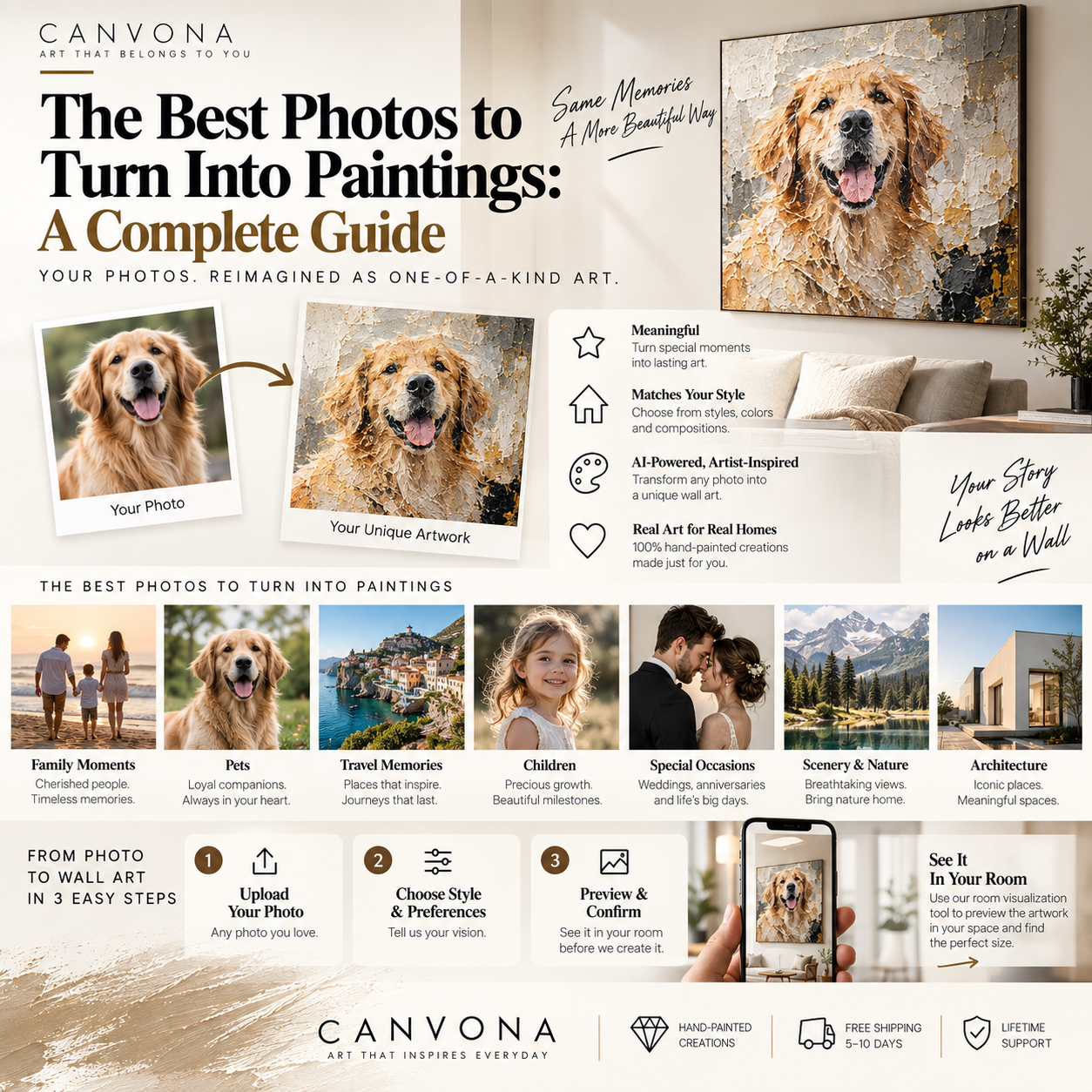
The best photo to turn into a painting is not always the sharpest, most professional or most technically perfect image.
The best photo is usually the one that combines three things:
a clear subject, meaningful emotion and enough visual information to guide the artwork.
That distinction matters.
A perfectly exposed photograph of someone looking directly at the camera may be technically excellent but emotionally ordinary.
A slightly imperfect photograph of your parents laughing together, your dog waiting by the front door, or your child walking along a beach may contain far more meaning.
When transforming a photograph into custom wall art, the goal should not simply be:
“Make this photograph look painted.”
A better goal is:
“Identify what makes this image meaningful, preserve that feeling and turn it into artwork that belongs in the home.”
That requires a little more thought.
This guide explains exactly how to choose the right photograph—and how to avoid the most common mistakes.
The first question should not be:
“Which photo has the most megapixels?”
Ask:
“Which photograph would I still care about ten years from now?”
Custom artwork often works best when the source image represents:
- a relationship;
- a person;
- a pet;
- a wedding;
- a family moment;
- a home;
- a place;
- or a memory.
Technical quality can often be improved or interpreted.
Emotional importance cannot be manufactured afterward.
For example:
A professional studio portrait may have perfect lighting.
But an ordinary phone photo of a father holding his daughter for the first time may become much more meaningful artwork.
Choose the image because of what it means first.
Then evaluate whether it contains enough visual information to work from.
One of the most important characteristics of a strong reference photo is visual clarity.
The viewer should immediately understand what matters.
That could be:
- one person;
- a couple;
- a family;
- a dog;
- a cat;
- a house;
- a mountain;
- a beach;
- a wedding moment.
Photographs with too many competing subjects can become difficult to translate into artwork.
Imagine a wedding reception photograph containing:
the couple;
twenty guests;
tables;
chairs;
lights;
flowers;
waiters;
signage;
and a large background.
The photograph may document the event well.
But a painting based on all those elements could feel visually confusing.
A stronger artistic interpretation might keep:
the couple,
the gesture,
perhaps the flowers,
and simplify almost everything else.
Good custom artwork does not need to preserve every object in the original photograph.
It needs to preserve the important ones.
A common problem occurs when the subject occupies only a tiny part of the photograph.
For example:
you want a portrait of your dog,
but the dog occupies only 8% of the image.
Or:
you want a painting of your parents,
but they are standing far away inside a large landscape.
This limits available facial and surface detail.
Whenever possible, choose a reference where the important subject occupies a meaningful portion of the image.
For People
You ideally want enough detail to see:
eyes;
facial structure;
hair;
expression;
and clothing.
For Pets
You ideally want clear information about:
eyes;
fur pattern;
ears;
face shape;
and body posture.
For Homes
You want enough architectural detail to understand:
roofline;
windows;
doors;
materials;
and proportions.
For Landscapes
The issue is slightly different.
A landscape can work very well from a wider image because the environment itself is the subject.
A photograph does not need studio lighting.
But clear lighting helps.
Strong reference photos usually allow you to understand:
the subject's shape;
facial features;
color;
and depth.
Good lighting examples
Soft daylight near a window.
Outdoor light during morning or afternoon.
Even indoor lighting with good facial visibility.
More difficult examples
Extremely dark images.
Strong backlighting where faces become silhouettes.
Blown-out highlights that remove facial detail.
Heavy colored lighting from clubs or events.
Very strong filters.
None of these automatically makes a photograph unusable.
But they can reduce the information available to the artist or design process.
If your artwork includes people or pets, expression matters enormously.
Do not automatically choose the photograph where everyone is:
centered,
looking at the camera,
and smiling formally.
Ask:
Which image actually feels like them?
For a couple, it may be:
a glance;
a laugh;
walking together;
holding hands.
For a child:
running;
looking curious;
sleeping;
playing.
For a pet:
a particular head tilt;
a familiar sitting position;
an expression everyone in the family recognizes.
Modern smartphones and social apps can dramatically alter photographs.
Filters may change:
skin tone;
eye color;
background color;
contrast;
sharpness;
and facial structure.
If you want the final artwork to feel natural, provide the original unfiltered photograph whenever possible.
You can always ask for artistic color changes later.
Starting with the cleanest visual information usually gives you more options.
Many customers reject meaningful photos because the background is unattractive.
That is often unnecessary.
A photograph might contain:
cars;
people;
street signs;
chairs;
trash cans;
power lines;
or cluttered furniture.
Those things do not necessarily need to remain in the painting.
A custom art process can often simplify or remove background elements while preserving the main subject.
For example:
Original photo
A couple standing outside a restaurant with parked cars behind them.
Final artwork
The couple remains.
The cars disappear.
The background becomes a softer architectural or abstract environment.
The emotional moment stays.
The visual clutter does not.
This is one of the biggest advantages of turning a photo into artwork instead of simply printing the photograph.
Portrait-based artwork depends heavily on facial information and expression.
Best options
Clear faces.
Natural expressions.
Good lighting.
Subjects large enough in the image.
Reasonable camera distance.
Meaningful interaction between people.
More difficult options
Faces hidden behind sunglasses.
Subjects photographed from very far away.
Strong blur.
Very dark faces.
Extreme filters.
Hands covering important facial features.
Again, difficult does not necessarily mean impossible.
But you should understand that fewer visual details require more artistic interpretation.
Wedding photography is one of the strongest sources for custom wall art.
But the obvious formal portrait is not always the best choice.
Consider:
the first dance;
walking away from the ceremony;
a quiet moment;
a spontaneous laugh;
the couple looking at each other;
a silhouette against the venue.
The photograph should represent the relationship rather than simply prove that the wedding happened.
Ask Yourself
If this photo were hanging in your living room ten years from now, would it still make you feel something?
That is a much better test than:
“Is this the official wedding portrait?”
Pet portraits are especially emotional because people recognize very subtle details about their animals.
A dog owner immediately notices:
ear position;
eye expression;
body posture;
and characteristic markings.
Choose a photograph that captures those details.
Best dog or cat photo
Eye level with the pet when possible.
Clear eyes.
Visible markings.
Natural lighting.
A familiar expression.
Avoid when possible
Heavy flash.
Extreme wide-angle distortion.
Strong blur.
Pet photographed from far above.
Tiny subject in a large room.
For memorial artwork, don't obsess over finding the technically best photo.
Choose the one that brings back the right memory.
Family photographs can become beautiful custom paintings, but composition matters.
A photo containing three or four people is generally easier to turn into a coherent painting than a photograph containing twenty people.
With larger groups, consider whether everyone needs to remain.
Another option is to use several reference photographs.
For example:
one photograph has the best expression from the mother;
another has the best image of the child;
another shows clothing detail more clearly.
Multiple references can sometimes provide better information than one imperfect image.
However, combining people from different photographs requires careful design so that:
lighting;
perspective;
scale;
and body position
still feel natural.
Travel photography works particularly well when it contains a strong sense of place.
Good examples include:
coastlines;
mountains;
deserts;
lakes;
city streets;
architecture;
European villages;
national parks;
and honeymoon locations.
Look for strong visual structure.
A useful landscape often has:
Foreground
something close to the camera.
Middle distance
the main environment.
Background
mountains, sky, ocean or architecture.
This creates depth.
However, highly detailed travel photographs do not have to remain highly detailed.
A custom painting may simplify the scene dramatically while preserving:
the horizon;
the color;
the atmosphere;
or one recognizable landmark.
A first home.
A childhood home.
A family farm.
A vacation property.
A house where someone lived for decades.
These locations can carry enormous emotional value.
For a custom house painting, the best reference usually shows:
the complete façade;
clear rooflines;
windows;
doors;
architectural details;
and enough surrounding context.
What can often be removed?
Cars.
Garbage bins.
Power lines.
Temporary decorations.
People walking past.
Unattractive neighboring details.
The objective is not necessarily photographic realism.
It is to preserve the identity of the home.
Sometimes the most meaningful photograph is also the oldest.
Perhaps you only have:
a faded family photograph;
a scanned print;
a low-resolution digital file;
or an image with scratches.
Do not automatically reject it.
Older images may still contain enough information for artistic interpretation.
The final painting does not necessarily need to reproduce every missing detail realistically.
A softer, more painterly style can work especially well with historical photographs.
In fact, slight visual softness can become part of the emotional character.
Black-and-white photographs are not limited to black-and-white artwork.
You have several options.
Option 1: Keep It Monochrome
This creates a timeless, sophisticated result.
Option 2: Add Subtle Warm Tones
Cream, sepia or warm gray can soften the composition.
Option 3: Reinterpret in Color
If enough reference information exists, color can be introduced creatively.
However, if historical accuracy matters, avoid inventing colors without reference.
Sometimes the emotional power of the original monochrome photograph is stronger than colorization.
The shape of your source photograph does not always need to determine the final artwork orientation.
A vertical portrait photograph could potentially become:
vertical art;
square art;
or a wider composition with an expanded background.
Similarly, a horizontal photograph could be cropped or simplified.
But the final orientation should ultimately consider where the artwork will hang.
This is an important distinction.
You are not only transforming a photo.
You are creating wall art.
One of the most common mistakes in custom art is selecting the painting size based only on the photograph.
The room matters more.
For example:
a family portrait might look excellent as a 24 × 18-inch piece in a hallway.
The same artwork above a large living-room sofa may need to be 48 × 36 inches or larger.
Before finalizing size, measure:
wall width;
furniture width;
available vertical space;
and nearby architectural features.
For art above a sofa or bed, a useful starting point is often a total artwork width of approximately 60% to 75% of the furniture below it.
Then adjust based on the actual composition.
A beautiful photo can become several very different artworks.
Possible directions include:
Realistic
Preserves facial and visual details closely.
Best for:
people;
pets;
houses.
Painterly Acrylic
Recognizable but visibly artistic.
Good balance between likeness and expression.
Impressionistic
Focuses more on atmosphere, light and color.
Excellent for landscapes and travel memories.
Minimalist
Simplifies detail and keeps only essential forms.
Works well in contemporary homes.
Monochrome
Black, white and gray.
Timeless and easy to integrate into interiors.
Abstract Interpretation
Uses the photograph as inspiration rather than literal reference.
Particularly useful for:
landscapes;
architecture;
motion;
or emotional moments.
The best style is not simply the one you like on its own.
It should also make sense for the source image.
This question is surprisingly important.
Imagine a scale from 1 to 5.
Level 1 — Highly Realistic
Very close to the reference photograph.
Level 2 — Painterly Realism
Clearly recognizable, but visibly painted.
Level 3 — Simplified
Important subjects remain recognizable; details are reduced.
Level 4 — Semi-Abstract
You recognize the subject, but color and form dominate.
Level 5 — Abstract
The photograph becomes inspiration rather than a literal representation.
Different subjects suit different levels.
A memorial portrait may require stronger likeness.
A travel landscape might become more expressive.
A wedding photograph may work beautifully somewhere in the middle.
The original photograph may contain colors that do not work well in the intended room.
Customization creates an opportunity to adjust them.
For example:
original photo contains bright green grass and blue sky.
Your room contains:
cream;
walnut;
rust;
and black.
The final artwork might preserve the composition while shifting the palette toward:
muted olive;
warm beige;
soft blue-gray;
and rust.
The memory remains recognizable.
The finished artwork belongs more naturally in the interior.
This should be done thoughtfully.
Important personal details should not be changed casually.
Before approving custom artwork, identify details that are emotionally important.
For example:
a wedding dress;
a pet's markings;
a distinctive house color;
a grandmother's necklace;
a bouquet;
a military uniform;
a specific location.
These details may be more important than the background.
Communicate them clearly.
A good custom process should know the difference between:
decorative detail
and
meaningful detail.
Sometimes the best solution is to provide several references.
Photo A may show:
the best facial expression.
Photo B:
better eye detail.
Photo C:
the correct coat color of the dog.
Photo D:
the location.
These references can help create a more informed result.
But combining references requires judgment.
Do not assume every piece of every photograph should be merged.
That can lead to an artificial composition.
Use multiple photos to improve information—not to overload the design.
AI is particularly useful before physical production begins.
Why?
Because describing art in words is difficult.
Imagine telling someone:
“Make it less realistic, but not too abstract. Keep the couple recognizable, simplify the flowers and make the colors warmer.”
Different people will imagine different results.
AI-assisted concept development can show several visual directions quickly.
For example:
Version 1
Soft painterly realism.
Version 2
Textured contemporary acrylic.
Version 3
Minimalist neutral interpretation.
Now the customer can react visually.
That makes communication much clearer.
AI should not automatically make every creative decision.
Generated imagery can sometimes:
change faces;
alter hands;
invent jewelry;
change architecture;
or remove details that actually matter.
This is why the process still needs human judgment.
At Canvona, we believe technology should help customers explore and communicate ideas, while human review and craftsmanship remain important when translating those ideas into physical artwork.
The philosophy is simple:
AI helps explore.
People decide.
Craftspeople create.
Before producing a large custom piece, try to see how it will work in the space.
This is especially useful for:
large portraits;
wedding paintings;
family artwork;
and landscapes.
Ask:
Is the scale right?
Does the orientation work?
Do the colors relate to the room?
Is the artwork too visually busy?
Would a black, white, gold or other frame work better?
At Canvona, room visualization is designed to help customers see the relationship between the artwork and the actual interior before making the final decision.
This can reduce one of the biggest problems in online wall-art shopping:
guessing.
Mistake 1: Choosing the Sharpest Photo Instead of the Most Meaningful
Technical quality helps.
Emotion matters more.
Mistake 2: Choosing a Photo Where the Subject Is Tiny
If the subject matters, provide enough detail.
Mistake 3: Trying to Keep Every Background Object
Art is not a police evidence photograph.
Simplification often improves the result.
Mistake 4: Ignoring the Final Room
The photograph is only the starting point.
The finished painting still needs to work in the home.
Mistake 5: Making a Very Large Painting From a Weak Source Without Considering Style
Low-detail photos may work better with a softer, more interpretive style than with strict realism.
Mistake 6: Using Only One Reference When Better Information Exists
If another photo clearly shows important details, provide it.
Mistake 7: Expecting a Hand-Painted Artwork to Match Pixel for Pixel
A painting is an interpretation.
Real paint, brushwork and texture naturally create variation.
That is part of the value of physical art.
27. A Simple Photo Selection ChecklistBefore uploading your image, ask:
Does this photo mean something to me?
If no, choose another.
Is the main subject clear?
If no, look for a stronger composition.
Can I see the important details?
If no, find another reference if possible.
Is the expression right?
Especially important for people and pets.
Are there distracting objects?
Decide whether they should be removed.
What must remain unchanged?
Identify emotionally important details.
What can be simplified?
Background, minor objects and unnecessary visual clutter.
What artistic style fits this image?
Realistic, painterly, minimalist, impressionistic or abstract.
Where will the artwork hang?
This determines orientation, size and color.
Have I previewed the final concept in the room?
If possible, do this before production.
The most technically perfect image is not always the one worth turning into art.
Sometimes the best reference is:
a slightly grainy wedding photo;
an old image of a childhood home;
a phone picture of a dog sleeping in its favorite spot;
a vacation photo taken seconds before sunset;
or a family image that nobody planned.
What makes custom art valuable is not simply image quality.
It is the relationship between the image and the person who owns it.
A digital photograph may sit among 20,000 other files on a phone.
Turning one important image into physical artwork changes the way that memory is experienced.
It becomes part of the home.
The best photos to turn into paintings usually share a few characteristics:
they have a clear subject;
they contain meaningful emotion;
they provide enough visual information;
and they represent something worth remembering.
Good lighting helps.
Resolution helps.
Composition helps.
But none of those matters as much as meaning.
Start by choosing the photograph you actually care about.
Then decide:
what must remain;
what can disappear;
how realistic the final art should be;
what size works in the room;
which colors should stay;
and what artistic style best expresses the memory.
AI can help you explore possibilities.
Designers can help refine them.
And skilled painters can transform the approved concept into a physical object with real brushwork, texture and presence.
The purpose is not to make a photograph look “artistic.”
It is to create something that deserves to live outside your phone.
Have a photograph that means something to you? Upload your image to Canvona, explore different artistic directions, preview the artwork in your room and create a custom piece designed around your story and your space.