What Wall Art Works Best in a Mid-Century Modern Home?
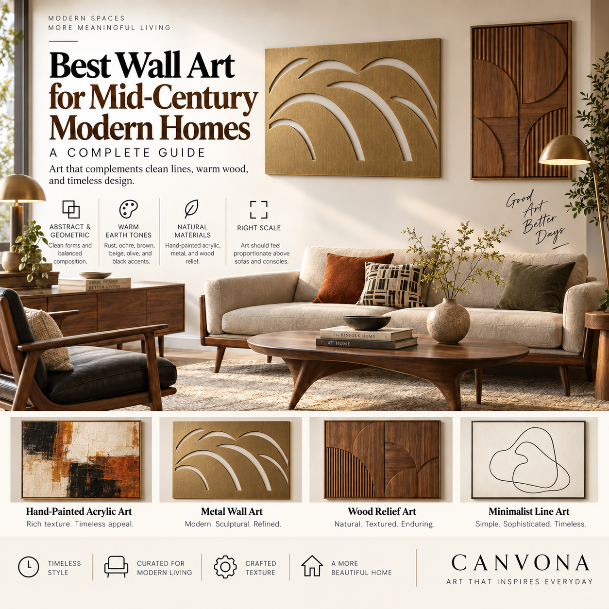
The best wall art for a mid-century modern home usually combines strong composition, confident scale, warm or earthy colors, organic or geometric forms, and a clear relationship with the furniture and architecture around it.
But there is an important distinction.
A mid-century modern interior does not need wall art that looks as though it came directly from 1958.
In fact, filling a room with starbursts, atomic patterns, mustard yellow, boomerang shapes and vintage reproductions can quickly make the space feel themed rather than sophisticated.
The strongest contemporary mid-century interiors usually do something more subtle.
They respect the design principles of the period—clean lines, warm woods, functional forms, restrained ornamentation and a connection to nature—while introducing artwork that feels relevant today.
That means your wall art might be:
- a large hand-painted abstract painting;
- an organic minimalist composition;
- a geometric acrylic work;
- a black-and-white statement piece;
- a warm neutral textured painting;
- or a sculptural piece of laser-cut metal wall art.
The goal is not to make your home look like a museum.
The goal is to make the artwork feel naturally connected to the design language of the room.
First, What Is Mid-Century Modern Design?
Mid-century modern generally refers to a design movement associated with the middle decades of the twentieth century, particularly the postwar period.
Its enduring popularity comes from a combination of simplicity and warmth.
Typical elements include:
- clean architectural lines;
- low-profile furniture;
- tapered or sculptural legs;
- walnut, teak and other warm woods;
- functional design;
- simple geometric forms;
- organic curves;
- relatively uncluttered rooms;
- and an emphasis on indoor-outdoor connection.
Unlike some minimalist interiors, however, mid-century modern design rarely feels cold.
Wood, leather, woven textiles, color and curved forms usually bring warmth to the space.
This gives wall art an important role.
The artwork often becomes the element that connects the room's geometry with its personality.
One of the easiest mistakes when shopping for wall art is starting with a painting you like and only later asking whether it works in the room.
For mid-century interiors, begin with the major visual anchors.
Look at:
- the sofa;
- credenza;
- dining table;
- fireplace;
- wood tones;
- wall color;
- windows;
- and ceiling height.
Ask yourself:
What is already dominant in this room?
If you have a long walnut credenza and a low-profile sofa, the room already contains strong horizontal lines.
A horizontal painting or diptych may naturally continue that visual rhythm.
If the room has tall windows, a narrow fireplace or a vertical architectural feature, vertical wall art may provide better balance.
Wall art should work with the proportions of the room rather than simply occupy unused wall space.
There are several visual directions that work particularly well with mid-century modern interiors.
Geometric Abstract Art
Geometry is one of the most obvious choices.
Circles, arcs, lines, blocks and asymmetrical shapes relate naturally to mid-century furniture and architecture.
But avoid compositions that feel overly decorative or cartoonishly retro.
A modern interpretation usually works better.
For example, instead of a literal 1950s atomic print, consider a hand-painted composition with:
- two or three large geometric forms;
- warm neutral backgrounds;
- black linear accents;
- muted rust;
- olive;
- cream;
- or deep brown.
The result references mid-century design without looking like reproduction décor.
Organic Abstract Art
Mid-century modern design was never purely geometric.
Designers of the era frequently explored organic forms inspired by:
plants,
stones,
landscapes,
the human body,
and nature.
Organic abstract wall art can therefore work beautifully.
Look for:
- curved lines;
- irregular shapes;
- soft asymmetry;
- simplified botanical forms;
- flowing compositions.
This can be especially useful if your furniture is already very linear.
A curved artwork can soften the room.
Minimalist Art
Mid-century interiors usually benefit from visual clarity.
Minimalist artwork with strong negative space can complement this beautifully.
However, minimalist does not have to mean plain.
Texture can create depth even when the composition contains only a few elements.
A large cream, black and warm-brown hand-painted acrylic work may contain very little visual information and still become a powerful focal point because of scale and material.
Black-and-White Art
Black-and-white art works particularly well when a room already contains multiple wood tones or strong upholstery colors.
It can add structure without introducing another competing palette.
Consider:
- abstract brushwork;
- minimalist line compositions;
- geometric forms;
- monochrome textured acrylic;
- black laser-cut metal art.
Black can also connect visually with common mid-century details such as:
black lighting fixtures,
window frames,
chair legs,
or metal hardware.
Color is strongly associated with mid-century design, but that does not mean every room needs mustard yellow and avocado green.
The most useful approach is to think in color relationships, not stereotypes.
Warm Earth Tones
Colors that often work naturally include:
- rust;
- terracotta;
- burnt orange;
- tobacco brown;
- walnut;
- ochre;
- warm beige;
- muted olive.
These colors relate well to wood furniture and can make the room feel warmer.
Olive and Muted Green
Muted green can create an especially strong relationship with walnut or teak.
It also reinforces the period's connection to nature.
For a contemporary interpretation, choose sophisticated tones such as:
olive,
sage,
moss,
or deep forest green,
rather than highly saturated lime or avocado.
Blue as Contrast
Muted navy, slate blue or desaturated blue can work beautifully with warm woods.
Blue introduces temperature contrast.
For example:
a walnut credenza,
cream wall,
cognac leather chair,
and muted blue abstract painting
can create a very balanced palette.
Cream, Mushroom and Warm Neutral
If your mid-century room already contains strong furniture forms, you may want the artwork to be quieter.
Warm neutrals such as:
cream,
mushroom,
taupe,
sand,
and stone
can work extremely well.
The key is to use texture or composition to keep neutral art from becoming visually flat.
Avoid Perfect Color Matching
Your painting does not need to contain exactly the same orange as your chair.
In fact, trying to match everything can make the interior look overly coordinated.
A stronger approach is to repeat one or two colors loosely and allow the artwork to introduce something new.
Think:
relationship rather than replication.
Wood is one of the defining materials of mid-century interiors.
Walnut, teak and other warm-toned woods naturally influence which artwork works around them.
Above Walnut Furniture
Art containing:
- cream;
- black;
- rust;
- olive;
- bronze;
- muted blue;
- or warm white
usually creates a comfortable relationship with walnut.
If both the artwork and furniture contain very similar brown tones, however, the composition may visually disappear.
A little contrast helps.
For example:
dark walnut credenza
- warm cream wall
- beige painting with black and rust accents
may work better than:
dark walnut
- brown wall
- brown painting.
Many classic mid-century spaces include smooth surfaces:
wood veneer,
glass,
polished metal,
molded furniture,
flat painted walls.
Textured artwork can therefore create a compelling contrast.
Hand-painted acrylic art with visible brushwork or palette-knife texture adds a tactile layer without requiring more furniture.
This is particularly effective in updated mid-century interiors where the goal is not to recreate a period room but to make it feel more current.
Why Real Texture Matters
A printed image can visually represent texture.
A genuinely hand-painted surface interacts physically with light.
When natural light moves across the artwork, raised paint creates subtle highlights and shadows.
That gives the wall another layer of material depth.
For a quiet room containing simple furniture, that physical variation can be extremely effective.
Metal wall art may not be the first material people associate with mid-century modern interiors.
But it can work extremely well when chosen carefully.
Why?
Because mid-century design often uses graphic forms and architectural structure.
Laser-cut metal wall art can provide both.
Good options include:
- geometric compositions;
- organic curves;
- botanical silhouettes;
- abstract lines;
- architectural forms.
Best Metal Finishes
Matte Black
Matte black works particularly well in modernized mid-century spaces.
It can connect with:
lighting,
chair legs,
black hardware,
or architectural window frames.
Bronze
Bronze introduces warmth and pairs beautifully with walnut and teak.
It is an excellent option when you want metal art that feels less industrial.
Brass-Inspired Finishes
Warm brass can work well as an accent, particularly in rooms containing vintage-inspired lighting or brass hardware.
Use it selectively.
Too much gold can shift the room toward glamour rather than mid-century restraint.
Negative Space Matters
One of the distinctive characteristics of laser-cut metal art is that the wall becomes part of the composition.
The open areas reveal the actual wall behind the artwork.
That means the same piece may look very different against:
white,
cream,
olive,
charcoal,
or wood-paneled walls.
For that reason, metal wall art should always be evaluated in relation to the wall color—not only as an isolated product image.
Mid-century furniture is often visually long and low.
That makes undersized artwork especially noticeable.
Imagine a long walnut credenza with a tiny framed piece floating above it.
Even if the art is beautiful, the relationship feels weak.
Above a Sofa
A useful starting point is artwork—or a complete artwork grouping—approximately 60% to 75% of the sofa width.
For example, above a 90-inch sofa, you might begin evaluating artwork around 54 to 68 inches wide.
This is not a rigid rule.
But it prevents the very common mistake of choosing something dramatically too small.
Above a Credenza
Credenzas are especially common in mid-century interiors.
Because they are often long and low, they work naturally with:
- horizontal artwork;
- diptychs;
- a large square painting;
- or a carefully balanced sculptural metal piece.
Avoid placing art so high that the credenza and artwork no longer feel connected.
A gap of roughly 6 to 12 inches can be a useful starting point depending on accessories and furniture height.
Dining Rooms
Mid-century dining spaces often contain strong furniture silhouettes.
A large horizontal abstract painting can provide visual balance behind a long dining table.
If the dining set already contains dramatic sculptural chairs, quieter artwork may work better.
Both can work—but they create very different results.
One Large Artwork
Choose one large piece when you want:
- a stronger focal point;
- a cleaner look;
- visual calm;
- easier installation;
- or more impact with fewer objects.
This approach works particularly well in modern interpretations of mid-century design.
Gallery Wall
Choose a gallery wall if the room has a more collected personality.
A successful mid-century gallery wall might combine:
- abstract art;
- vintage photography;
- architectural drawings;
- travel imagery;
- small paintings;
- and graphic pieces.
Try to create cohesion through:
frame color,
spacing,
palette,
or subject matter.
The goal should be “collected over time,” not “random collection of rectangles.”
Diptychs and Pairs
A pair of coordinated artworks is an excellent middle ground.
Two square paintings above a credenza can create symmetry without looking overly formal.
A diptych above a sofa can provide the presence of one large composition with slightly more visual rhythm.
Not every mid-century modern home has the same personality.
There is an important difference between:
Authentic Vintage Mid-Century
Original furniture, vintage lighting and period architecture.
Here, contemporary art can prevent the room from looking like a time capsule.
Contemporary Mid-Century
Modern home with walnut furniture, clean lines and retro references.
Here, abstract painting and metal wall art work especially well.
Eclectic Mid-Century
Vintage furniture mixed with contemporary pieces, art, textiles and personal objects.
This gives you much more freedom.
The lesson:
Don't automatically choose retro wall art simply because the furniture is mid-century.
Sometimes contrast creates the strongest result.
Mid-Century Living Room
The living room usually supports the largest statement piece.
Consider:
- oversized abstract acrylic;
- horizontal textured painting;
- diptych;
- black or bronze metal wall art.
Let the artwork establish a relationship with the sofa or credenza.
Mid-Century Bedroom
Bedrooms usually benefit from calmer compositions.
Good directions include:
- soft geometric abstraction;
- organic neutral art;
- warm textured acrylic;
- simple black-and-white compositions.
Above a bed, one wide piece or a balanced pair often works well.
Mid-Century Dining Room
Dining rooms can support stronger color.
Rust, olive, burnt orange or deep blue can create a beautiful connection to warm woods.
Large horizontal art works particularly well behind long dining tables.
Mid-Century Home Office
A home office gives you more freedom to use:
graphic compositions,
architectural art,
abstract metal pieces,
or more energetic color.
Artwork should provide personality without creating excessive visual distraction behind the workspace.
Mid-Century Entryway
The entryway is ideal for one strong piece.
Above a narrow console, consider:
- square abstract painting;
- vertical composition;
- sculptural metal art;
- minimalist organic artwork.
Because the entryway creates the first impression of the home, avoid cluttering it with too many unrelated objects.
Mistake 1: Making Everything “Retro”
A vintage sofa, atomic lamp, starburst clock, geometric rug and retro poster can quickly become too much.
Choose a few strong references.
Let other elements be contemporary.
Mistake 2: Buying Art That Is Too Small
This is one of the most common wall-art problems in almost every style.
Mid-century furniture's long horizontal lines can make small art look even smaller.
Measure before buying.
Mistake 3: Matching Every Color
Your painting does not need to match the upholstery, rug and accessories.
Too much coordination can remove visual tension.
Mistake 4: Ignoring the Wood Tone
Artwork that looks excellent against a white product-page background may behave differently beside dark walnut.
Always evaluate the complete room.
Mistake 5: Choosing a Print When You Actually Want Texture
If physical brushwork matters to you, make sure the product is genuinely painted rather than simply printed with an image of texture.
Look for close-up and angled photographs.
Mistake 6: Hanging Art Too High
Artwork should feel connected to the furniture rather than floating near the ceiling.
Before ordering, follow this process.
Step 1: Photograph the Wall
Take a straight-on image of the room.
Step 2: Measure the Furniture
Record the width of the sofa, bed or credenza below the artwork.
Step 3: Measure Available Wall Space
Include nearby windows, sconces and architectural elements.
Step 4: Identify Existing Colors
Note wall color, upholstery, rug and major wood tones.
Step 5: Choose the Desired Role
Do you want the artwork to:
blend,
balance,
or become the focal point?
Step 6: Choose Material
Hand-painted acrylic for:
texture, warmth and painterly character.
Laser-cut metal for:
graphic structure, negative space and architectural presence.
Step 7: Compare Sizes
Do not simply choose “Medium” or “Large.”
Compare actual dimensions against your furniture.
Step 8: Preview It in the Room
This is where digital visualization can remove much of the uncertainty.
A mid-century room may contain:
walnut,
cream,
rust,
black,
brass,
and several architectural elements.
A traditional ecommerce filter cannot easily understand all of that.
At Canvona, our AI-assisted room experience is designed to begin with the customer's actual room.
The idea is simple:
Upload your room → understand the style and colors → narrow suitable artwork → compare sizes → preview the piece in your own space.
AI can help answer:
What scale makes sense?
Which artwork relates to the room?
What materials work?
What colors coordinate?
But the final decision should remain yours.
Your home is personal.
No algorithm knows which artwork will create an emotional connection for you.
Perhaps the most important design principle is this:
Do not create a mid-century room simply by checking off mid-century products.
A beautiful home may contain:
a vintage credenza;
a contemporary sofa;
a hand-painted abstract artwork;
a modern metal sculpture;
family books;
travel objects;
and a new lamp.
What connects those things is not a product category.
It is the person living there.
Wall art gives you an opportunity to introduce that personality.
It does not have to be historically accurate.
It has to feel right.
The best wall art for a mid-century modern home usually succeeds because it understands the underlying design language of the space.
Look for:
confident scale;
clean composition;
warm or balanced color;
organic or geometric form;
real material presence;
and
a thoughtful relationship with the furniture around it.
Geometric abstract paintings can reinforce the architecture.
Organic artwork can soften it.
Textured acrylic can add depth.
Black or bronze laser-cut metal can add structure.
Large-scale pieces can give long, low furniture the visual anchor it needs.
But the strongest choice will always be the artwork that works with the room and still feels personal to you.
Mid-century modern design has lasted for decades because it was never just about appearance.
At its best, it combines beauty, function and human experience.
Your wall art should do the same.
Ready to see what works in your own space? Upload a photo of your room to Canvona's Room Preview Tool, explore artwork selected for your interior, and compare different sizes before you decide.