
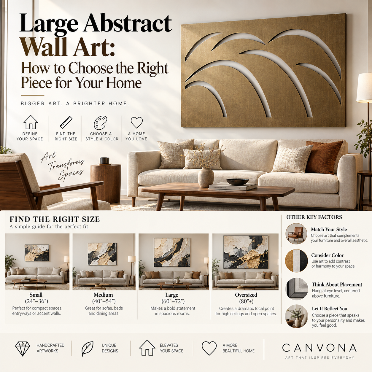
How Do You Choose Large Abstract Wall Art?
The best large abstract wall art is not simply the biggest painting that fits on your wall.
It is a piece that has the right scale, visual weight, color relationship, texture and emotional presence for the room around it.
That distinction matters.
A 60-inch painting can look dramatic in one room and surprisingly small in another. A neutral abstract painting can feel calm and luxurious in one space but almost disappear in another. A heavily textured work may become the focal point of a minimalist interior, while the same texture might feel overwhelming in a room already filled with strong patterns and materials.
Large abstract artwork works best when you stop thinking of it as a picture hanging on a wall and start thinking of it as part of the architecture of the room.
It affects how large the wall feels.
It influences where your eye goes first.
It can connect furniture colors.
It can make an empty room feel finished.
And because large artwork occupies so much visual space, choosing it carefully matters more than choosing several small decorative objects.
This guide will walk through the entire decision process.
The first step is obvious:
measure the wall.
But wall dimensions alone are not enough.
Suppose your wall is 14 feet wide.
That sounds like it can support very large artwork.
But if a 90-inch sofa sits below the artwork, the sofa becomes the more important visual reference.
Likewise, if your wall contains:
- windows;
- sconces;
- shelving;
- a fireplace;
- architectural trim;
- or a console,
the true usable area may be much smaller than the wall itself.
Before shopping, record three measurements:
Wall width
Measure the full architectural area.
Usable artwork area
Measure the clear space available after accounting for furniture, windows and fixtures.
Furniture width
Measure the sofa, bed, credenza or console directly below the artwork.
In many rooms, the furniture—not the wall—is the primary anchor.
One of the most useful starting guidelines is for the artwork—or complete artwork grouping—to occupy roughly 60% to 75% of the width of the furniture below it.
This is not a design law.
It is a practical starting range.
For example:
If your sofa is 84 inches wide, artwork somewhere around 50 to 63 inches wide may create a comfortable relationship.
If your sectional is 100 inches wide, a 36-inch painting may technically fit the wall but can easily feel too small.
That is one of the most common mistakes people make when ordering large wall art online.
They choose what sounds large rather than what looks large relative to the room.
Example
Imagine two paintings:
Painting A: 36 × 24 inches
Painting B: 60 × 40 inches
On a product page, both may appear substantial because each fills the screen.
Above a 96-inch sofa, however, they create very different experiences.
The 36-inch artwork may feel like an isolated decorative object.
The 60-inch artwork may become part of the room's overall composition.
This is why wall art size should always be evaluated in context.
Dimensions tell you how large an artwork is.
They do not tell you how large it feels.
Two paintings measuring exactly 60 × 40 inches can have completely different visual weight.
Consider:
Painting One
Cream background
Thin black line
Large areas of negative space
Soft, subtle texture
Painting Two
Deep black background
Heavy rust and gold forms
Thick texture
Strong contrast
Both have identical measurements.
The second will usually feel heavier and more dominant.
This concept is important because large abstract art interacts with a room through more than inches.
Visual weight comes from:
- dark versus light colors;
- strong versus subtle contrast;
- texture density;
- composition;
- amount of negative space;
- frame color;
- and surrounding wall color.
If your room already feels visually busy, large artwork with lower visual weight may work better.
If your room feels empty or under-designed, a stronger composition can create the focal point it needs.
Before thinking about style, ask:
What does this room need from the artwork?
Large abstract wall art generally plays one of four roles.
Role 1: The Main Focal Point
The artwork is the first thing you notice.
This works well in:
- living rooms;
- dining rooms;
- large entryways;
- offices;
- hotel-style bedrooms.
Choose stronger scale, clear composition and sufficient contrast.
Role 2: Add Color
Perhaps the room already works structurally but feels too neutral.
A large painting can introduce:
rust,
olive,
blue,
burgundy,
terracotta,
or another accent
without changing furniture.
This is often easier and more flexible than buying a brightly colored sofa.
Role 3: Add Texture
Many modern interiors contain:
smooth walls;
simple upholstery;
clean cabinetry;
glass;
stone;
and wood.
A hand-painted textured abstract can introduce a physical layer that makes the room feel less flat.
In this situation, you may not need dramatic color.
Texture itself becomes the statement.
Role 4: Connect Existing Elements
Sometimes a room contains several colors or materials that do not yet feel connected.
Artwork can create a visual bridge.
For example:
cream wall;
walnut credenza;
black lighting;
rust pillows.
A painting containing warm neutral tones, black and a small amount of rust can help those separate objects feel like part of one composition.
Orientation is often overlooked.
But the shape of the artwork should relate to the shape of the available space.
Horizontal Abstract Art
Horizontal artwork works especially well:
above sofas;
above beds;
above long consoles;
in dining rooms;
on long open walls.
It reinforces width and can make a space feel more expansive.
A wide painting above a low-profile sofa often feels especially natural in modern interiors.
Vertical Abstract Art
Vertical artwork works well:
between windows;
on narrow walls;
in entryways;
beside fireplaces;
in rooms with high ceilings.
Vertical art can visually increase height and help narrow spaces feel intentional.
Square Abstract Art
Square art is highly flexible.
It can work:
above a console;
above a fireplace;
between furniture pieces;
as one large central focal point.
A large square work often feels bold and contemporary because the proportions are very stable.
Diptychs and Triptychs
If one very large canvas is difficult to transport or install, a coordinated two- or three-piece composition can create similar scale.
When evaluating size, treat all panels plus the gaps between them as one artwork.
Three 24-inch-wide canvases separated by 2-inch gaps create a composition much wider than any individual panel.
Large artwork needs breathing room.
Bigger is not automatically better.
If the painting almost touches:
the ceiling;
adjacent walls;
windows;
or furniture,
it can make the room feel crowded.
The best large art generally has enough surrounding negative space to look intentional.
Think of the empty wall as part of the composition.
A beautiful painting needs visual margin just as a well-designed page needs whitespace.
For large furniture walls, you want the artwork to feel significant without feeling trapped.
Large artwork should usually relate to both human eye level and the furniture around it.
On an open wall, a useful general reference is to place the visual center around average eye level.
Above furniture, however, the furniture relationship becomes more important.
Above a sofa, a gap of approximately 6 to 10 inches between the top of the sofa and bottom of the artwork can often create a connected composition.
Above a console or credenza, approximately 6 to 12 inches may work depending on accessories and furniture height.
Avoid the common mistake of hanging large art too high simply because the wall is tall.
High ceilings do not mean people suddenly view art from the ceiling.
Color is one of the most intimidating parts of choosing abstract art.
The good news is that your artwork does not need to perfectly match your interior.
In many cases, perfect matching makes a room feel less sophisticated.
Instead, think in three approaches.
Approach 1: Harmonize
Choose artwork that repeats one or two existing room colors.
Example:
beige sofa;
walnut table;
cream wall;
painting containing warm beige, cream and deep brown.
The result feels calm and cohesive.
Approach 2: Contrast
A neutral room may benefit from artwork that introduces:
deep blue;
rust;
black;
olive;
or burgundy.
Contrast creates a focal point.
This can be especially effective
Approach 3: Bridge
Use art to connect several colors already present.
For example:
gray sofa;
warm oak;
black fixtures;
terracotta accessories.
A painting containing soft gray, warm cream, black and rust may unify the entire room.
Color temperature matters almost as much as color itself.
Warm colors include:
cream;
ochre;
rust;
terracotta;
warm brown;
bronze.
Cool colors include:
blue;
blue-gray;
some greens;
silver;
cool white.
A room dominated by warm wood may work beautifully with warm artwork.
But introducing a cool accent can also create sophisticated contrast.
Many shoppers assume beige, white or cream artwork will look boring.
That depends on the surface.
Large neutral art often relies on:
scale;
texture;
negative space;
and subtle tonal variation
instead of bright color.
A large hand-painted cream-and-black composition can have enormous impact when real palette-knife texture catches the light.
This is why neutral abstract art is particularly effective in:
organic modern;
minimalist;
wabi-sabi;
quiet luxury;
and contemporary interiors.
The fewer colors a painting contains, the more important physical surface and composition become.
Texture becomes dramatically more visible as artwork grows.
On a small painting, a palette-knife mark may be a minor detail.
On a 60-inch painting, texture can influence the character of the entire room.
Hand-painted acrylic art may contain:
raised paint;
broad brushwork;
palette-knife marks;
layered areas;
subtle changes in sheen.
These surfaces interact with light.
Morning sunlight may reveal one set of shadows.
Evening side lighting may create another.
This gives physical artwork a quality that is difficult to communicate in a single front-facing image.
If texture is one of the reasons you are considering large abstract art, always look for:
close-up images;
side-angle photography;
and video.
Both can decorate a home.
But they are different products.
Printed Abstract Art
Advantages may include:
lower cost;
high image consistency;
wide availability;
lighter production requirements.
It can be an excellent choice when budget and visual design are the main priorities.
Hand-Painted Abstract Art
A fully hand-painted acrylic work offers:
real brushwork;
physical texture;
surface variation;
human interpretation;
a stronger sense of material presence.
For large statement walls, the physical surface becomes especially noticeable.
At Canvona, our focus is on hand-painted and handcrafted artwork rather than printed reproductions.
That distinction is important because when a customer purchases a large statement piece, the material itself often becomes part of the reason for choosing it.
Living Room
The living room is usually the most natural place for large statement art.
Common placement:
above a sofa;
above a fireplace;
behind a sectional;
on a large open wall.
Living rooms can support stronger visual weight because they are larger and used more actively.
Bedroom
Bedrooms generally benefit from slightly calmer compositions.
Consider:
soft neutral abstracts;
organic forms;
limited color palettes;
subtle texture.
Above a king bed, wider artwork or a coordinated diptych often works better than one small vertical piece.
Dining Room
Dining rooms can support stronger colors because the artwork is not competing with a television or large upholstered sofa.
Try:
rust;
olive;
deep blue;
bronze;
or dramatic monochrome.
Large horizontal compositions often work particularly well along dining-room walls.
Entryway
The entry creates the first impression of a home.
A large square or vertical abstract piece can create impact with relatively little furniture.
Avoid overcrowding the area with many smaller decorative objects if the artwork is already strong.
Home Office
Art in a home office should add personality without becoming visually exhausting.
Graphic abstract art, architectural forms and more controlled palettes often work well.
Modern
Look for:
strong geometry;
clean color relationships;
large scale;
controlled composition.
Organic Modern
Look for:
warm neutrals;
earth colors;
curved forms;
natural movement;
real texture.
Wabi-Sabi
Look for:
restraint;
negative space;
natural imperfection;
earthy texture;
quiet asymmetry.
Mid-Century Modern
Look for:
geometric abstraction;
organic shapes;
warm colors;
black;
olive;
rust;
and compositions that work with walnut or teak furniture.
Contemporary Luxury
Look for:
oversized scale;
strong material presence;
sophisticated restraint;
high-quality framing;
and controlled color.
Luxury does not always mean gold.
Often it means fewer, better-chosen objects.
Lighting can significantly change abstract art.
Natural Light
Daylight reveals subtle color differences and texture.
Warm Evening Light
Warm lighting may make:
cream;
beige;
bronze;
rust
feel richer.
Cool Light
Cooler lighting may make blue, silver or gray more pronounced.
Directional Lighting
Directional or side lighting can dramatically emphasize texture.
If you are purchasing heavily textured art, consider where windows and lamps are located.
The painting may look completely different throughout the day.
That is not necessarily a problem.
It can be one of its most beautiful qualities.
The frame changes both finished dimensions and visual character.
Black Floating Frame
Creates definition.
Works especially well in:
modern;
minimalist;
mid-century;
high-contrast interiors.
White Frame
Creates a lighter, quieter effect.
Useful for soft or coastal rooms.
Gold or Warm Metallic Frame
Adds warmth and can suit:
luxury;
transitional;
warm neutral interiors.
No Frame / Gallery-Wrapped Canvas
Creates a more relaxed, contemporary appearance.
Always check whether online dimensions include the frame.
For large artwork, even a slim frame can meaningfully change the final width.
Mistake 1: Buying Too Small
This is by far one of the most common mistakes.
People hear “48 inches” and assume it is huge.
In a large room, it may not be.
Mistake 2: Choosing Color Before Scale
The perfect blue painting is still wrong if it looks tiny above the sofa.
Solve proportion first.
Mistake 3: Matching Everything
A painting that perfectly matches every pillow can make the room look staged.
Allow the artwork some independence.
Mistake 4: Ignoring Texture
If you are paying more for hand-painted art, inspect the actual surface.
Do not rely on one front-view image.
Mistake 5: Falling in Love With the Lifestyle Photo
Lifestyle photography is useful.
But room scenes can distort perceived size.
Always verify actual dimensions.
Mistake 6: Filling Every Inch of Wall
Large artwork still needs breathing room.
Mistake 7: Forgetting Viewing Distance
A highly detailed abstract work may be interesting close-up.
A simpler composition may work better when primarily viewed from 15 feet away.
Consider how people actually move through the room.
When buying large abstract wall art online, use this sequence.
Step 1
Take a straight-on photograph of the wall.
Step 2
Measure the furniture below it.
Step 3
Measure the clear available wall space.
Step 4
Decide whether the artwork should be the focal point or support the room.
Step 5
Choose orientation.
Horizontal, vertical or square.
Step 6
Choose approximate width based on furniture relationship.
Step 7
Identify two or three important colors already in the room.
Step 8
Decide whether you want harmony or contrast.
Step 9
Choose material.
Printed?
Hand-painted?
Heavily textured?
Step 10
Check finished dimensions and frame.
Step 11
Review close-up and angled images.
Step 12
Preview the artwork in your own room before ordering whenever possible.
The larger the artwork, the more expensive a sizing mistake becomes.
It affects:
shipping;
installation;
visual balance;
and potentially returns.
That is why large wall art is one of the categories where room visualization creates the most value.
At Canvona, our Room Preview Tool is designed to help customers begin with their own interior rather than a generic product mockup.
The idea is simple:
Upload your room → explore suitable artwork → compare different sizes → visualize placement → choose with more confidence.
Instead of asking:
“Does 60 × 40 sound too big?”
you can begin asking:
“Does 60 × 40 actually look right above my sofa?”
Those are very different questions.
The second is much easier to answer visually.
Large art is deeply personal.
AI can help identify:
compatible scale;
room style;
color relationships;
material preferences;
and suitable products.
But it cannot know which artwork creates an emotional response for you.
A useful recommendation system should move from:
thousands of artworks
to
a manageable shortlist.
Then you decide.
Technology should reduce uncertainty.
It should not remove taste.
Sometimes you find the right painting with one problem.
The size is wrong.
Or:
the blue needs to be warmer;
the composition needs a horizontal format;
the frame needs to be black;
the neutral needs to shift toward taupe.
For hand-painted art, some degree of customization may be possible depending on the design.
That is especially valuable for large artwork because large pieces play such an important role in the room.
A small color adjustment can influence several feet of visual space.
If you love the composition but something feels slightly wrong, ask about customization before abandoning the design.
The best large artwork does something smaller decorative pieces often cannot.
It organizes the room.
It creates hierarchy.
It tells your eye:
look here first.
Then the sofa, table, lighting and objects around it become supporting elements.
This is one reason large abstract art can actually make a room feel simpler.
Instead of filling a wall with ten unrelated objects, one powerful piece may be enough.
Choosing large abstract wall art is not about finding the biggest painting you can afford.
It is about finding the right relationship between:
artwork, wall, furniture, color, material, lighting and personal taste.
Start with scale.
Measure the furniture and usable wall space.
Then decide what the room needs:
a focal point,
more color,
more texture,
or greater visual unity.
Choose an orientation that reflects the architecture.
Use color to coordinate or contrast—not simply match.
Pay attention to visual weight.
If craftsmanship matters to you, look closely at real surface texture and production details.
And whenever possible, preview the artwork in your own room before making a large purchase.
The most successful large abstract artwork should not feel like something placed on the wall after the room was designed.
It should feel as though it belongs there.
Ready to stop guessing? Upload a photo of your room to Canvona's Room Preview Tool, compare different artwork sizes and styles in your own space, and choose your statement piece with greater confidence.